We Turn E-Commerce Email Lists Into Revenue Machines
Done-for-you email marketing with a guaranteed 3x ROI in 6 months. Strategy, design, copy, and automations — all handled.
 Klaviyo Partner
 Top Agency
Trusted by leading e-commerce brands


The Problem With Most Email Marketing
What you're dealing with
What we deliver
Services Built for Revenue
Everything you need to turn your email list into a consistent, scalable revenue channel.
Email Strategy
Data-driven strategies aligned with your goals. Competitor research, content calendars, and segmentation plans built for growth.
Email Campaigns
End-to-end campaign management — design, copy, A/B testing, scheduling, and performance reporting.
Email Automations
Welcome series, abandoned cart, post-purchase, win-back — all automated and optimized for conversions.
Email Audit
Technical audit covering deliverability, DKIM, SPF, DMARC, flow analysis, and list health — with a clear action plan.
Your Path to 3x ROI
A proven 6-month framework that delivers predictable, compounding email revenue.
Onboarding & Strategy
Complete audit of your current email setup, competitor analysis, customer segmentation, and a 6-month revenue-focused strategy.
Campaigns & Flows
Launch 12+ automated flows and targeted campaigns. Design, copy, segmentation — all handled by our team.
Scale & Optimize
Continuous A/B testing, list growth strategies, and advanced segmentation. This is where the 3x ROI guarantee kicks in.
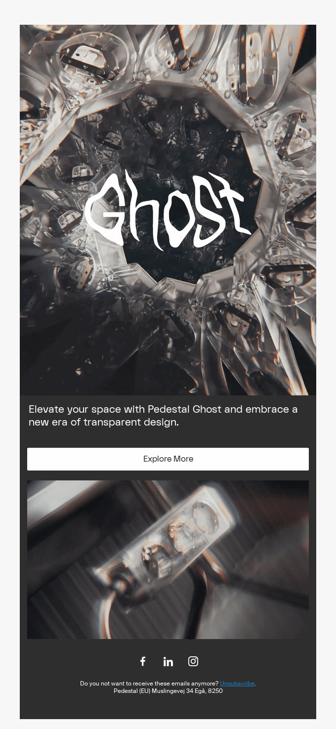
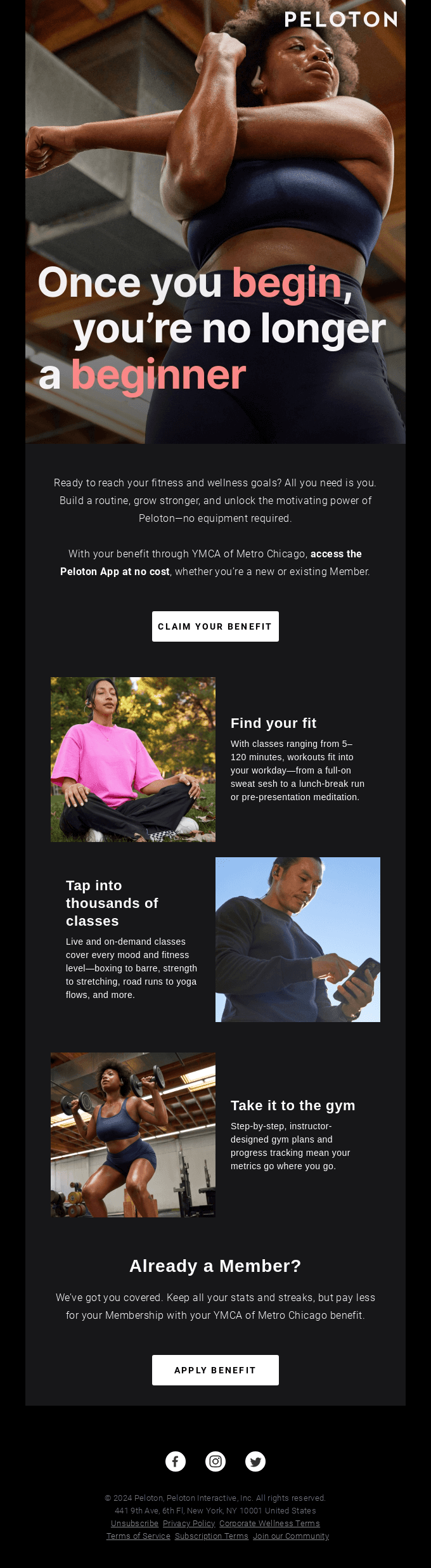
Designs That Speak of Expertise
What Our Clients Say
Excelohunt transformed our email marketing completely. Our revenue from email went from 8% to 42% of total revenue in just 4 months.
Sarah Chen
CEO, NovaStyle
The ROI speaks for itself. 47x return on our investment. Their team feels like an extension of our own.
Marcus Webb
CMO, Groom Haus
Best decision we made was handing email to Excelohunt. Our abandoned cart recovery rate tripled.
Lisa Park
Director of Marketing, 8 Other Reasons
Excelohunt transformed our email marketing completely. Our revenue from email went from 8% to 42% of total revenue in just 4 months.
Sarah Chen
CEO, NovaStyle
Trusted by Brands in 26+ Countries
From New York to Sydney, we've helped e-commerce brands across the globe turn email into their #1 revenue channel.

Ravinder
Founder & CEO
With 7+ years dedicated exclusively to email marketing, I've helped 500+ e-commerce brands turn their email lists into their most profitable marketing channel. I authored a book on customer retention strategies, available on Amazon, and our team is a proud Klaviyo Partner.
Read the Book on Amazon"Our goal is simple: To turn every email into an opportunity for growth."
Latest from Our Blog

Klaviyo vs Mailchimp: Which Is Better for E-Commerce in 2026?
We break down the features, pricing, and ROI potential of both platforms.

7 Klaviyo Flows Every E-Commerce Store Needs
From welcome series to sunset flows — the essential automations that generate revenue on autopilot.

Email Marketing ROI: Benchmarks & How to Improve Yours
Industry benchmarks reveal most brands leave money on the table.
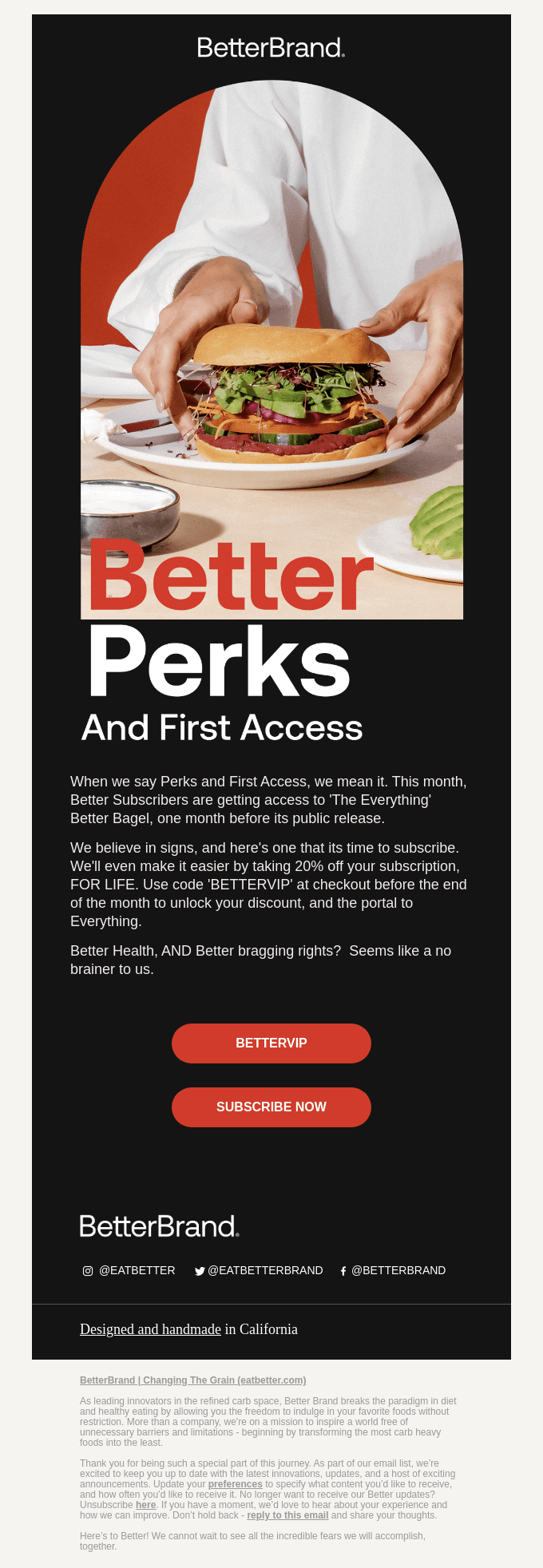
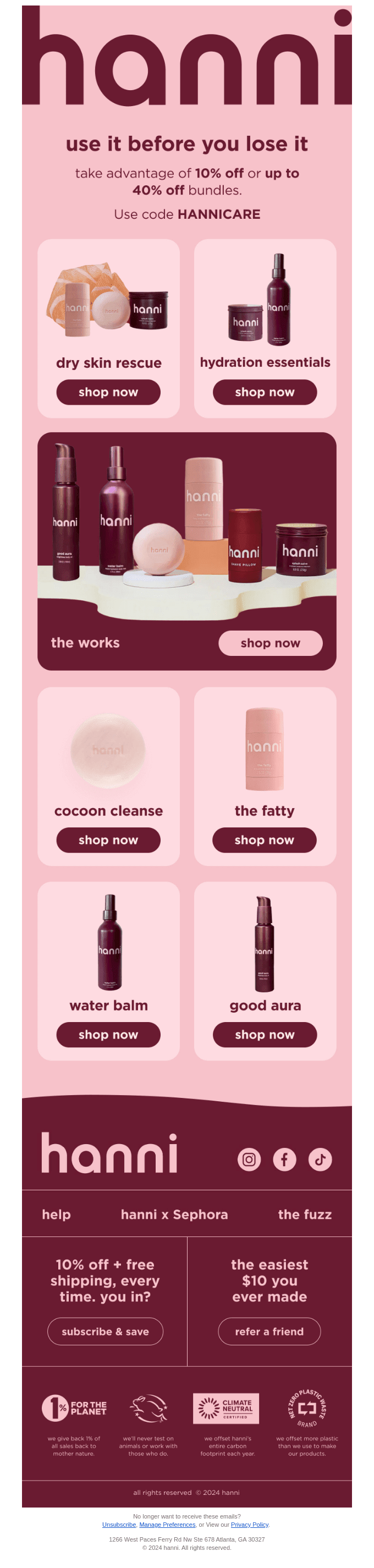
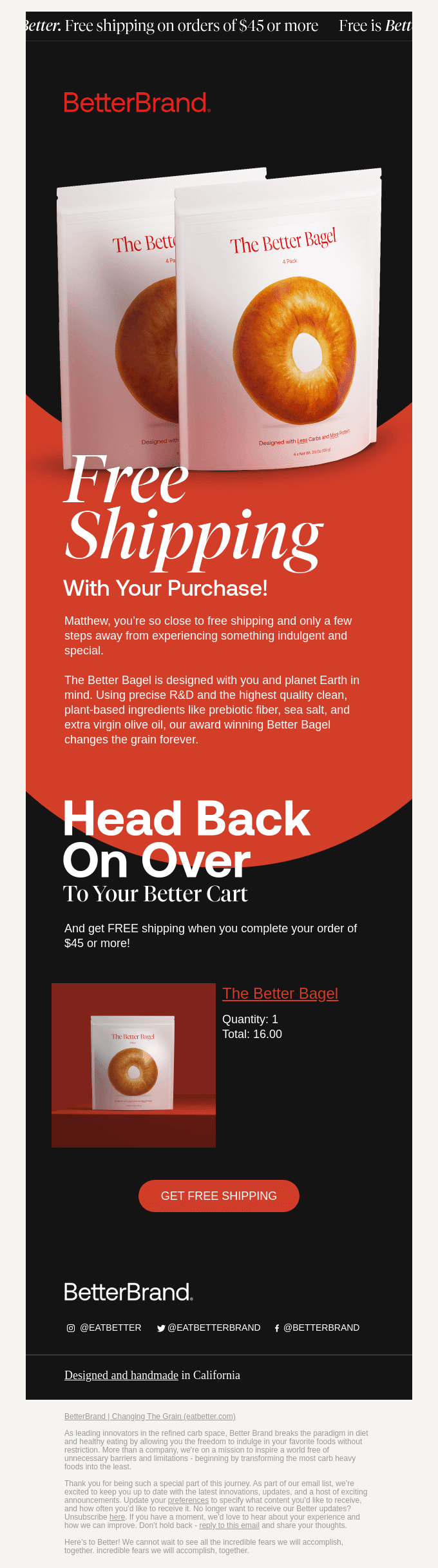
The Transformation
Real numbers from a real client.
Open Rate
Email Flows
Email Revenue
Frequently Asked Questions
Stop Leaving Revenue in Your Inbox
Get a free audit and discover how much revenue you're leaving on the table.